
C L I E N T
DURATION BEER
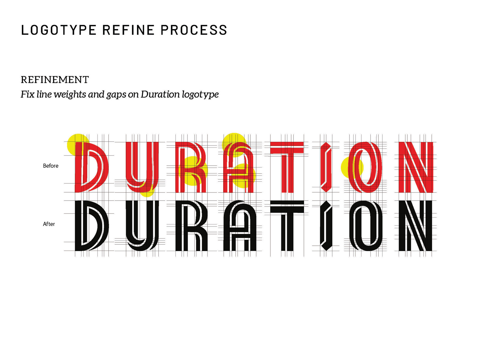
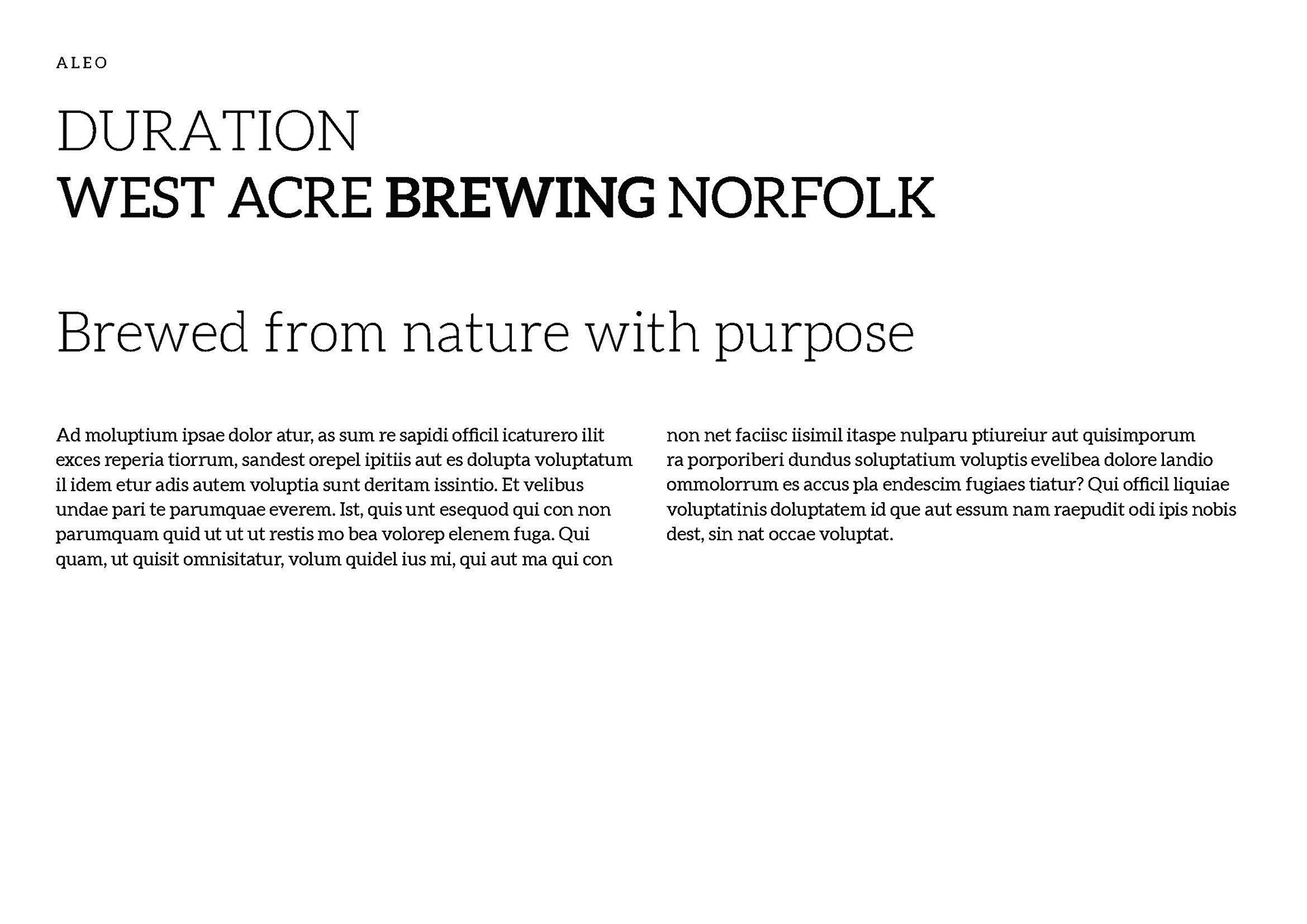
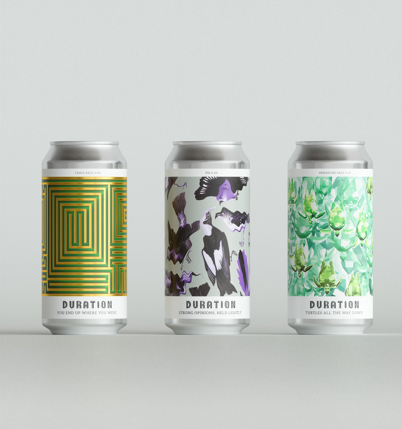
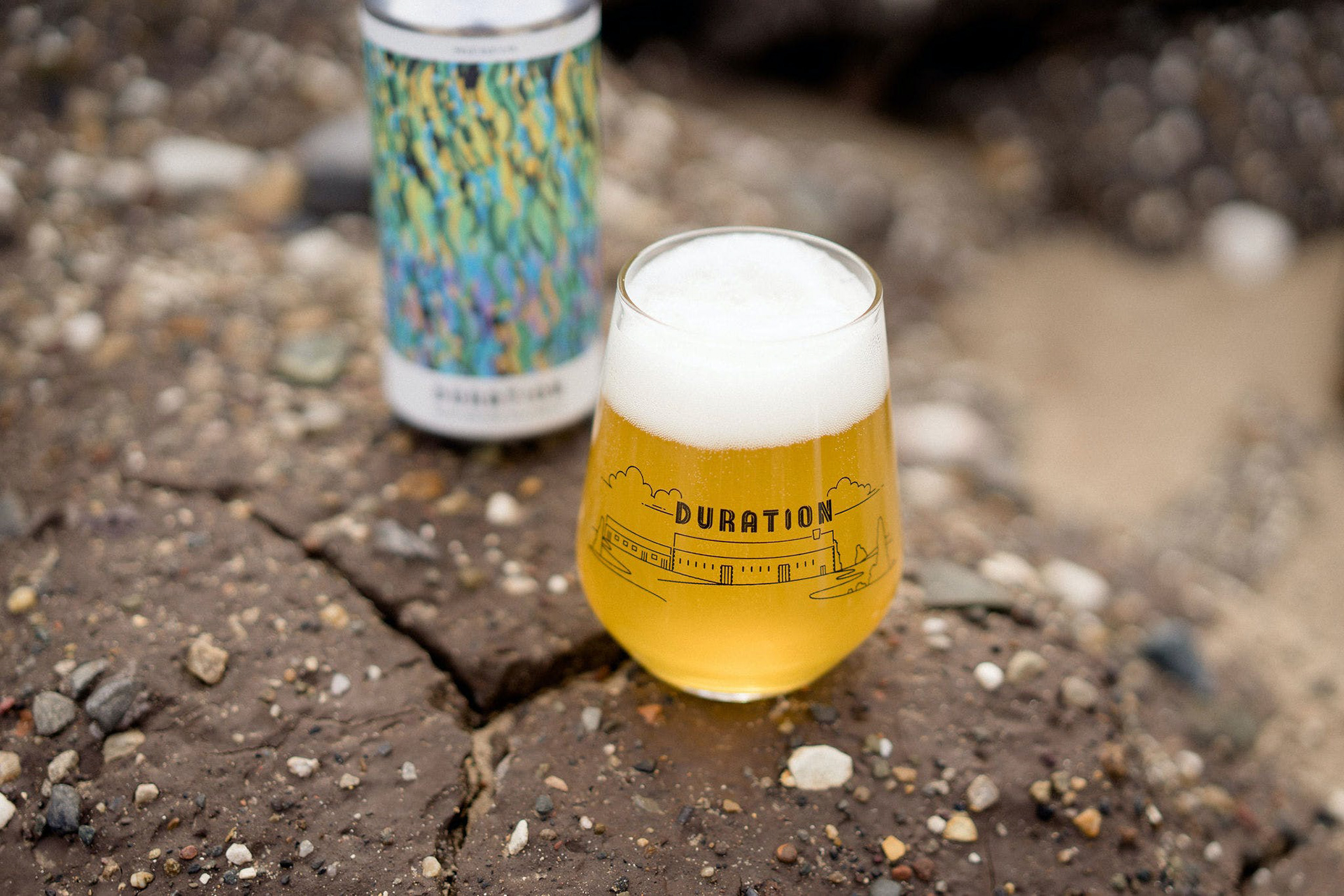
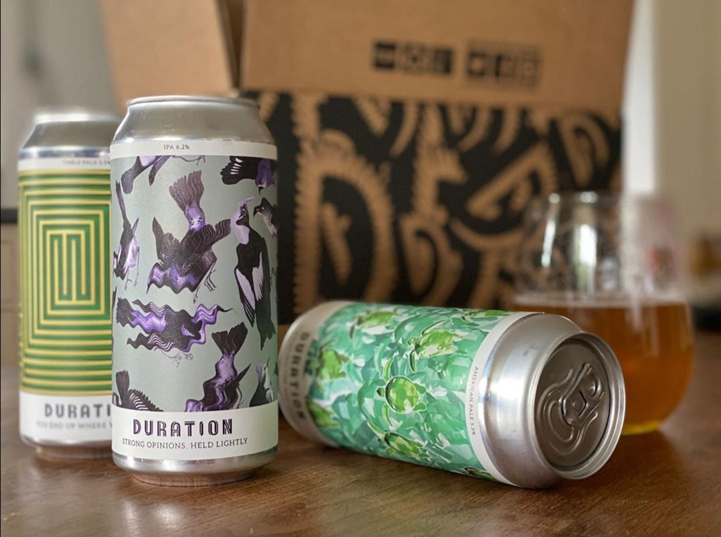
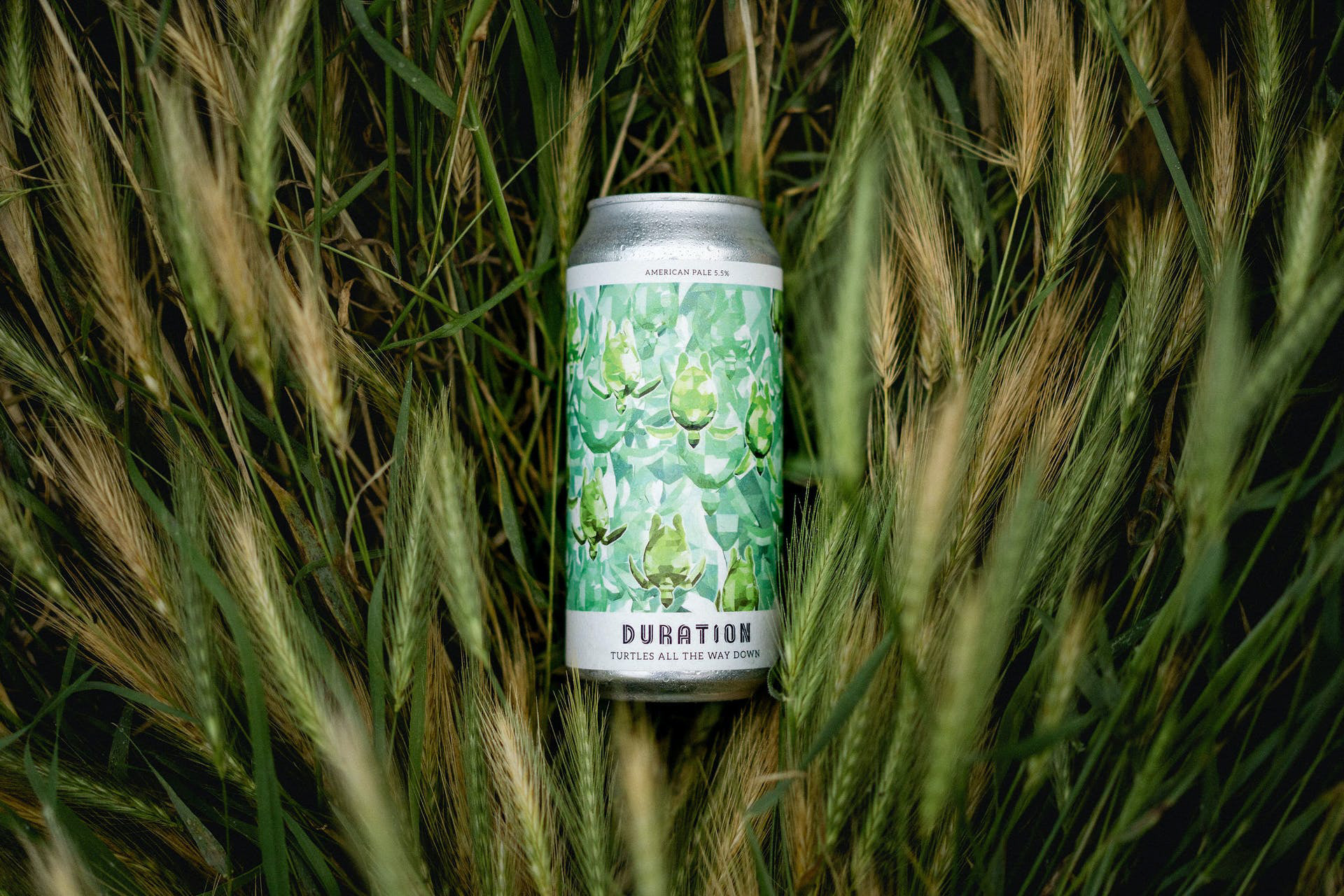
The newer look wears modern Möbius twist and reformed with even weight and line throughout. Also it ganged up with slab serif, Aleo that has semi-rounded details and a sleek structure. As a result, the new look embodied with high readability on can labels.
B R I E F
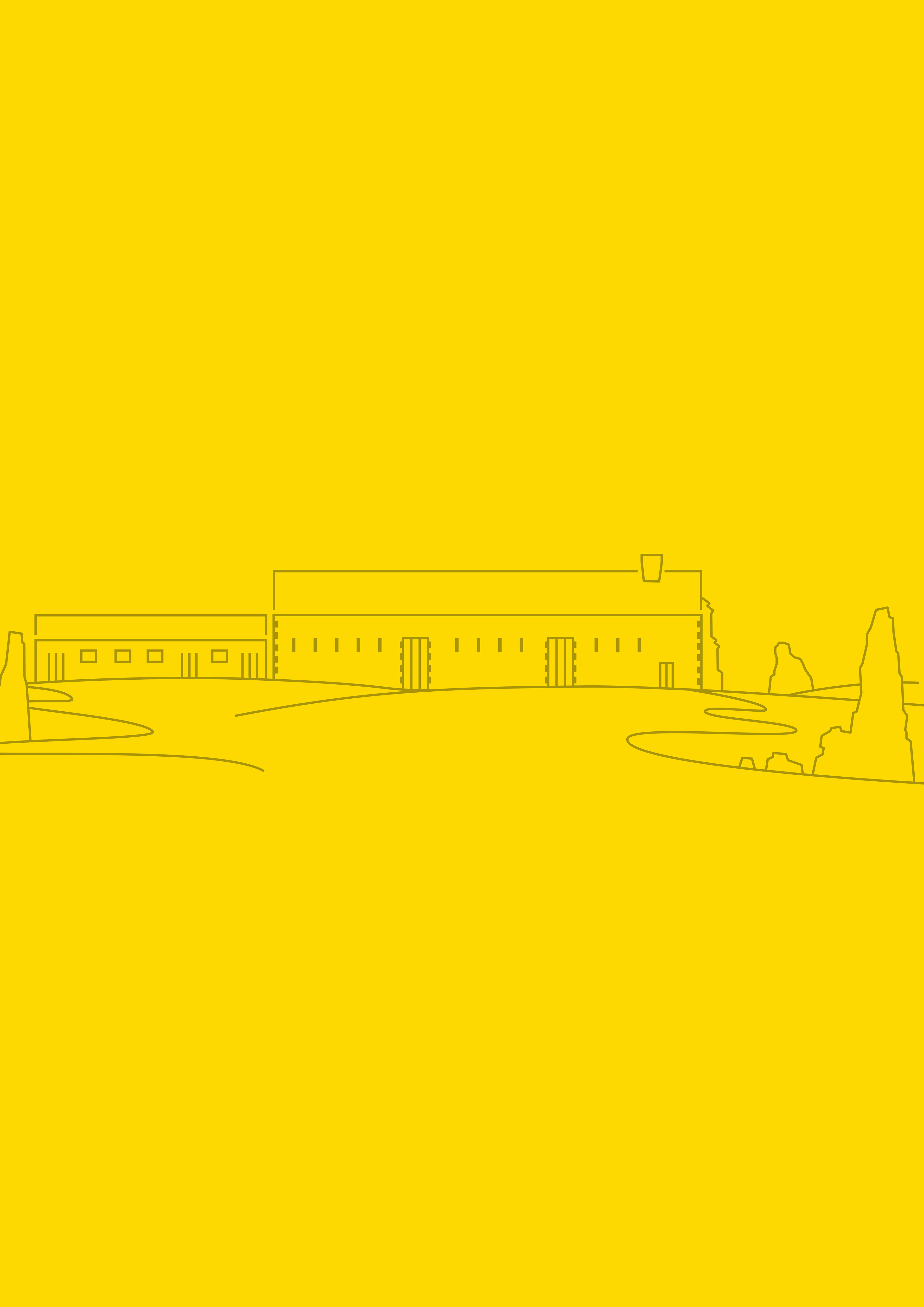
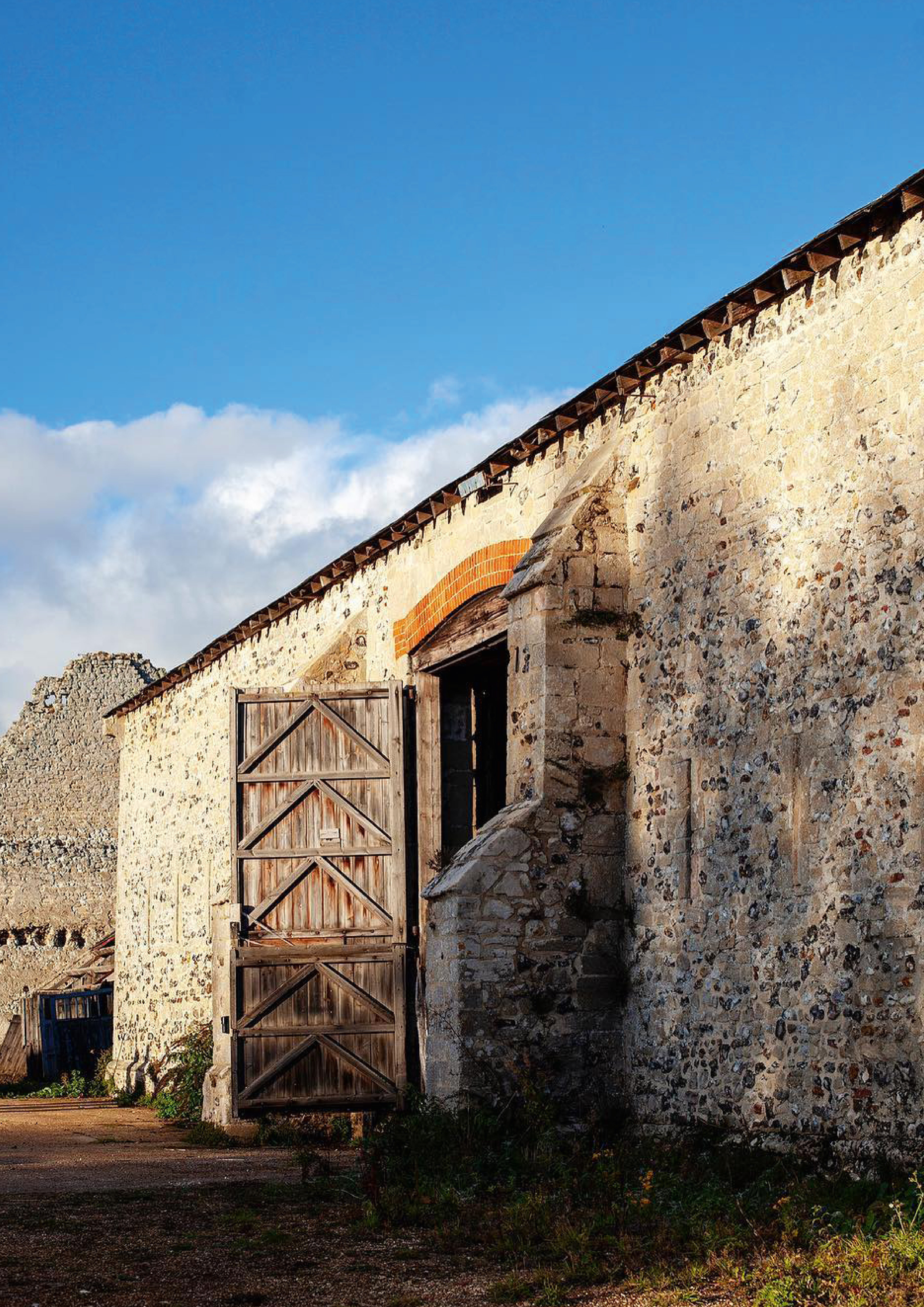
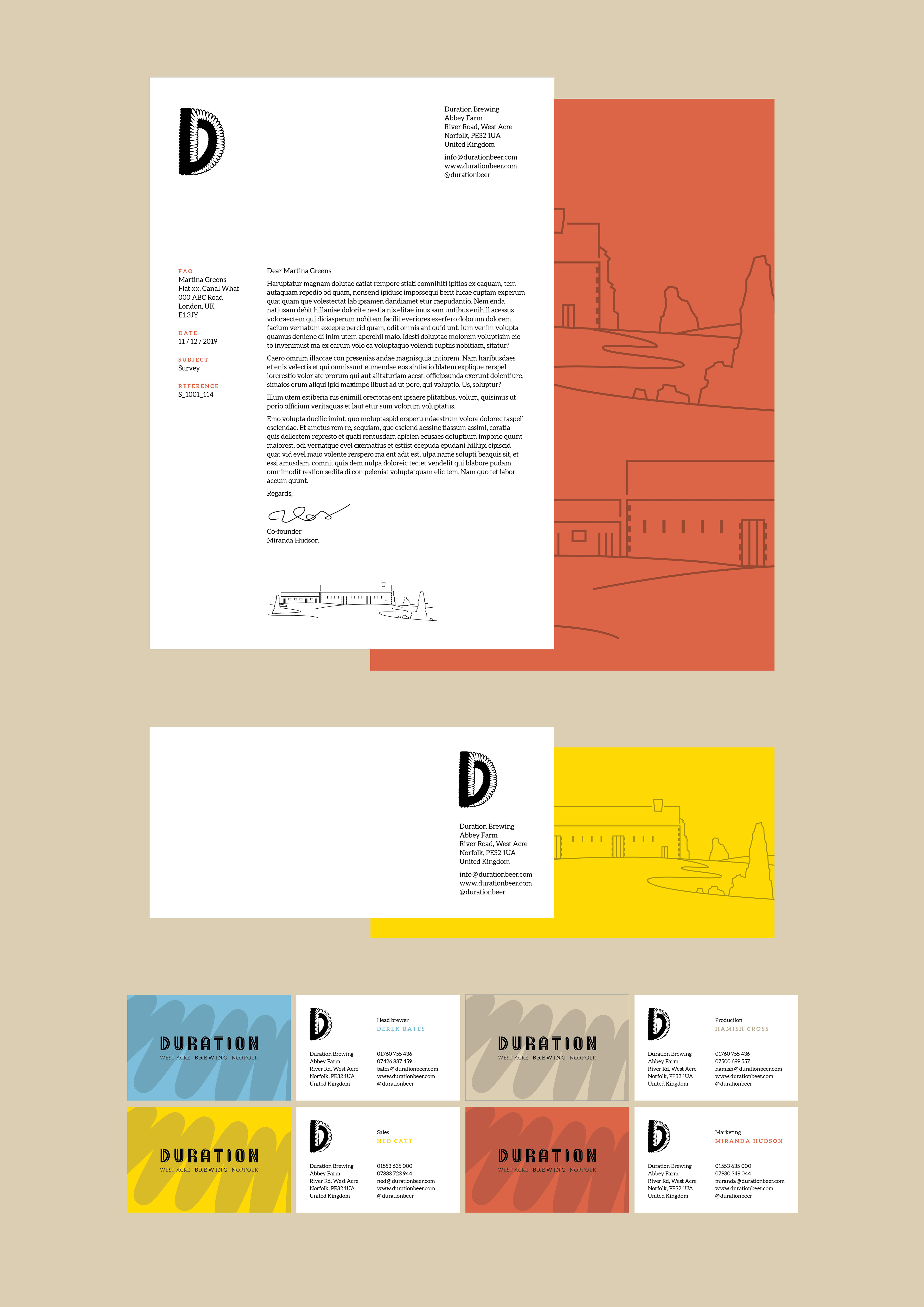
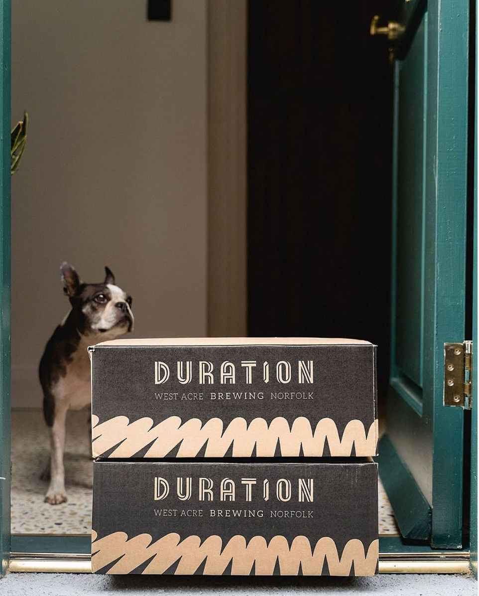
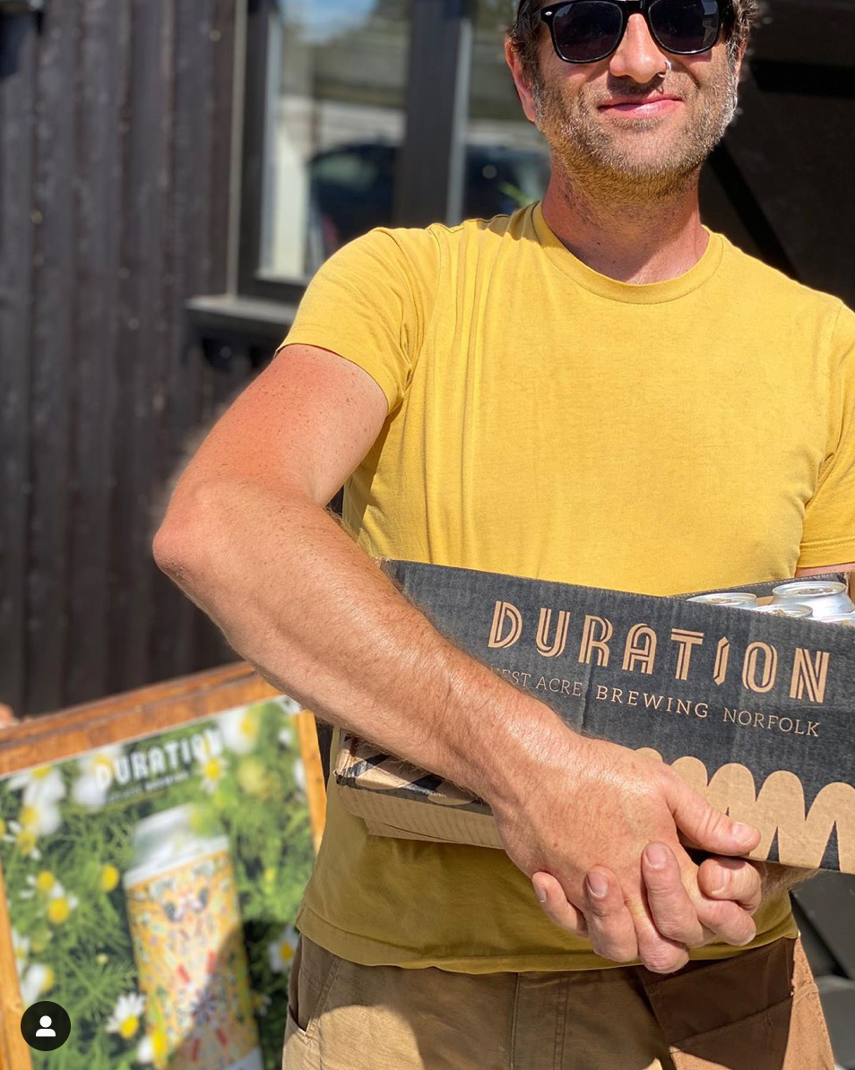
Phase 1 required a new logo, primary typeface and colour palette for this quality-driven farmhouse brewery in Norfolk. In phase 2, the logo will expand to package, stationery and goods in later 2019.
D E S I G N D I R E C T I O N
Erica Yunwook Choi, 5HT studio
A R T W O R K
Henry William Seigfried Muller