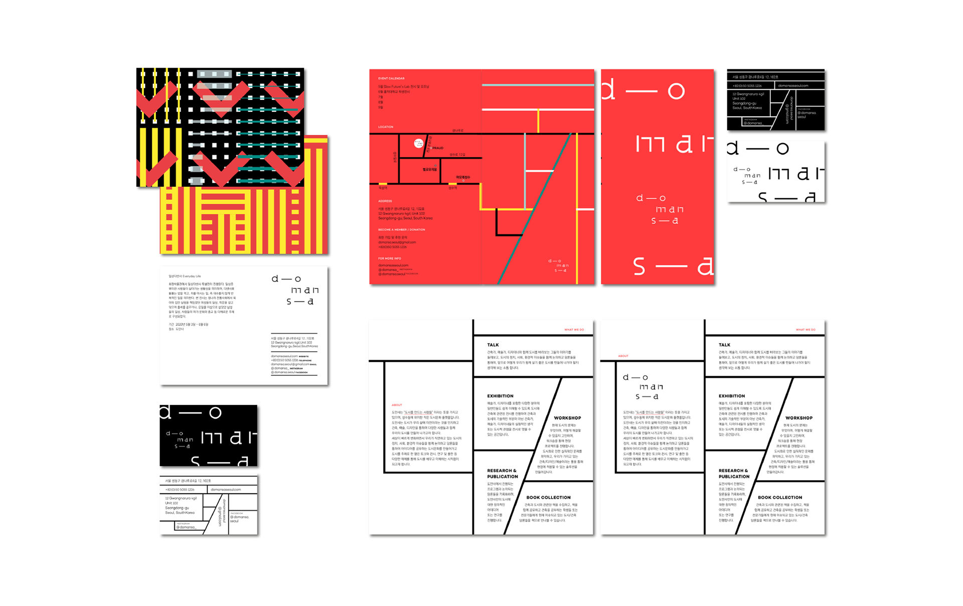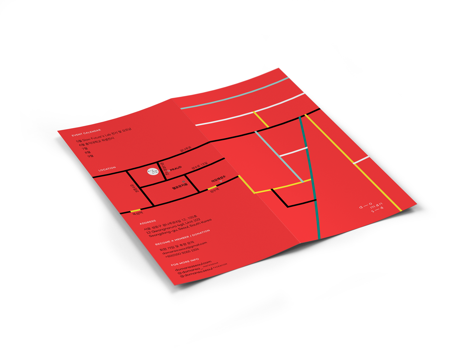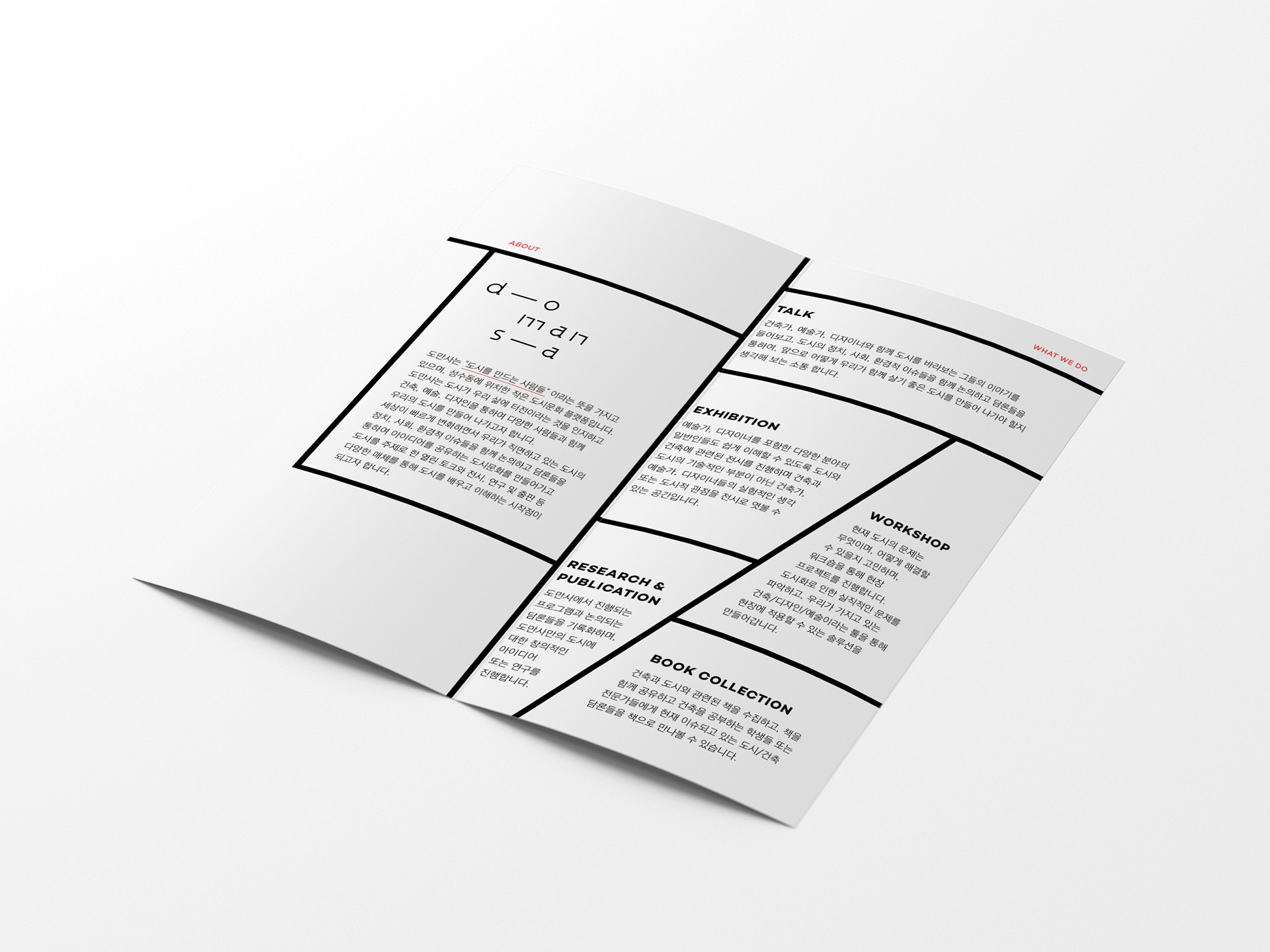

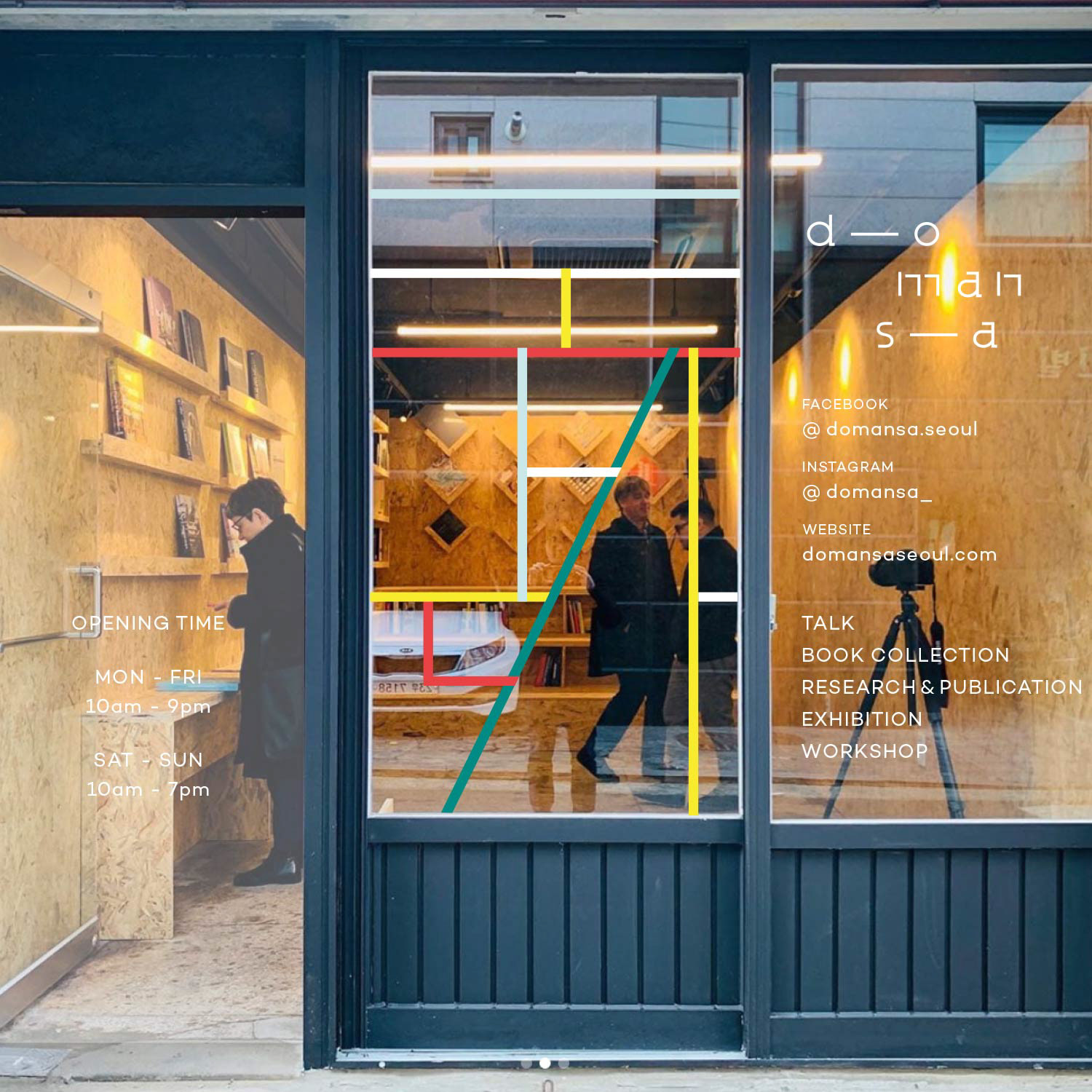
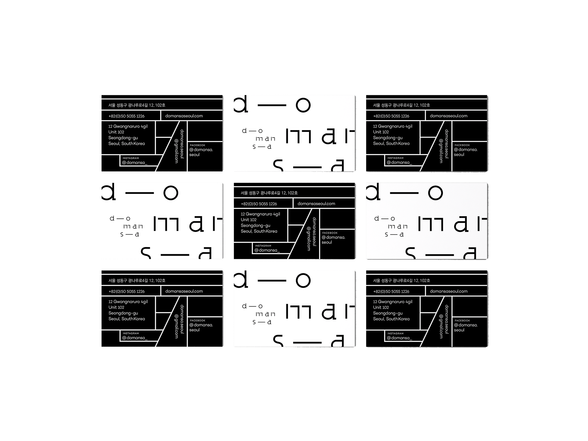
Brand solution for this small public library and cultural platform in Seong-Su, Seoul for urbanism and architecture.
With a subtle architectural undertone, the logo carries geometric and structural forms of grid system of cities.
Taking the shape of square and circle, the logo is both strong and playful – fitting for the space of discovery and possibility and it embodies Domansa’s complex mission of researching urban culture and architecture.
As a result, the space effectively reflects its purpose as one for creative thinking.
T o n a l g u i d e l i n e
Cool
Hip
Raw
Industrial
T A R G E T A U D I E N C E
Local architects
Designers
Artists
Writers
Local inhabitants
C R E A T I V E D I R E C T I O N
Erica Yunwook Choi

Korean lettering grid system ↑
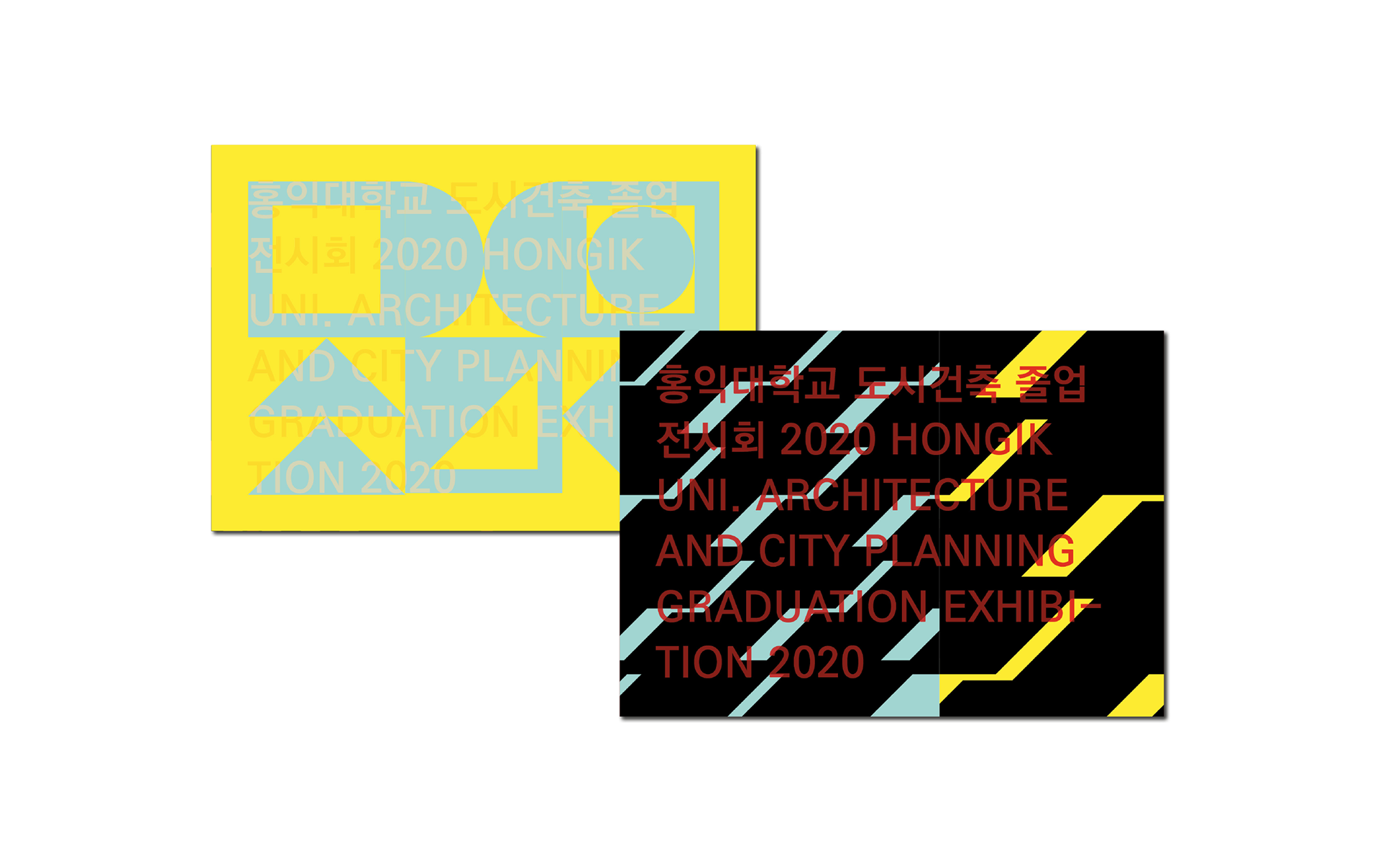

Post cards ↑